The direction
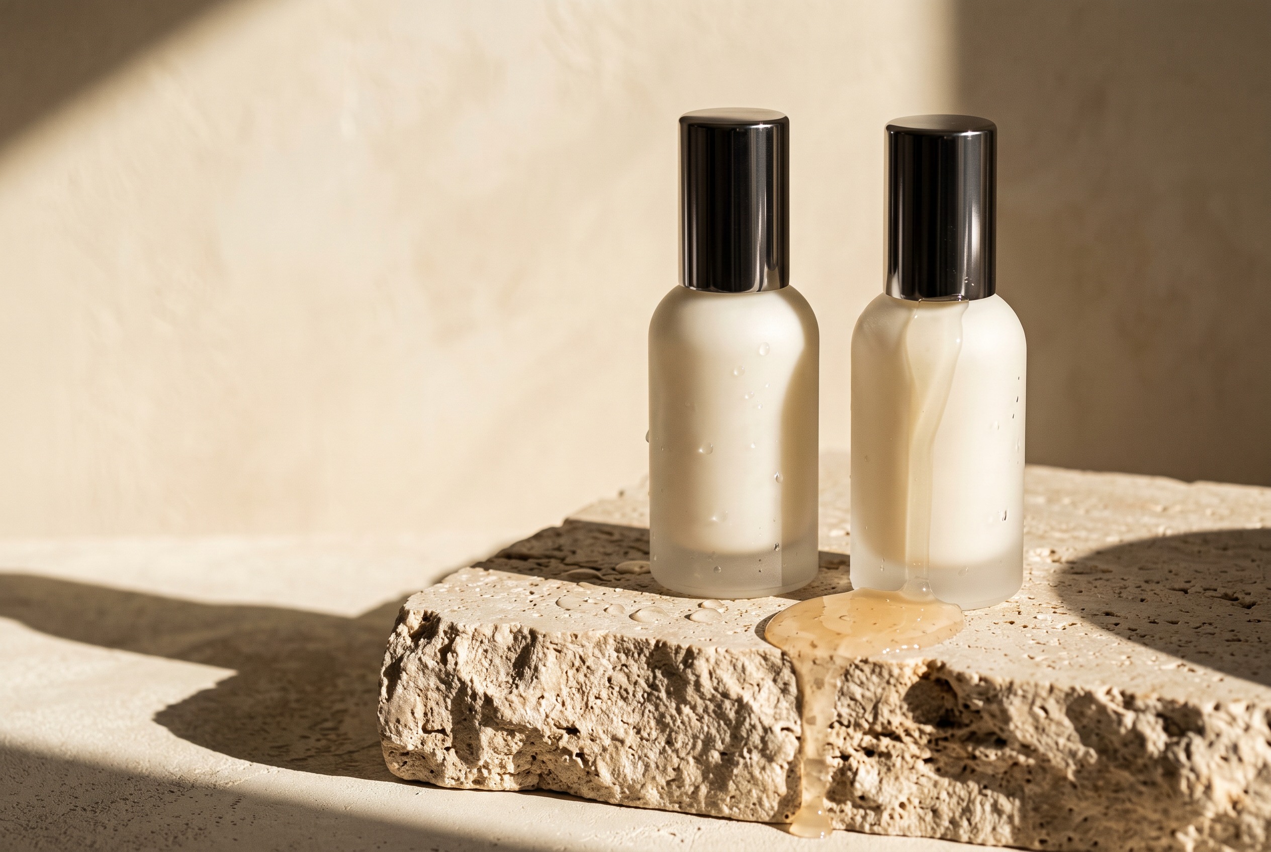
Soft mineral tones meet sharp editorial composition. Material, light and texture communicate care without making unsupported product claims.
Skincare / Self-initiated concept
The brief
Soft mineral tones meet sharp editorial composition. Material, light and texture communicate care without making unsupported product claims.
A concept identity, a product-led campaign and a three-part social content system. The same visual rules connect a launch image, an editorial story and a product detail.
01 / Digital expression
A consistent grid and restrained palette let product imagery move confidently between a campaign, a digital storefront and social formats.
A study in texture, simplicity and the objects we live with.
Discover the collectionFrom identity to everyday ritual
A paper identity application, a product screen and three social formats demonstrate how FORM can stay recognisable without repeating one layout.
Care is in the details.
Considered.
Every day.
The wordmark, mineral palette and repeatable number system connect stationery, packaging studies and editorial material.
A study in material, form and the objects we choose to live with.
A focused image sits beside a clear information hierarchy. Supporting details have their own space instead of competing with the main message.
FORMA considered ritual.
A typographic statement, a product-led image and an editorial notes format give the content system variety while retaining the same visual rules.
02 / Identity system
FORMSelf-initiated concept. No client commission, commercial launch or measured results are implied. Imagery is AI-generated and art-directed for this study.